

The QD-OLED text fix skips Samsung's 32-inch Odyssey G80SH


QD-OLED text looks fuzzy because the subpixels sit in a triangle instead of a vertical stripe. Samsung Display has now changed that with its fifth-generation V-Stripe panels. The 32-inch Odyssey G80SH is not one of them. It carries the older 4K panel at about 140 pixels per inch, down from 163 on a 27-inch 4K screen.
Key Takeaways
- The triangle subpixel layout is what makes QD-OLED text look fuzzy.
- Samsung’s new V-Stripe panels line the red, green and blue emitters up vertically.
- The 32-inch Odyssey G80SH appears to use the older panel, so text is unchanged.
- Stretching 4K from 27 to 32 inches drops density from 163 PPI to about 140.
- Test any OLED with black text on a white page at 100 percent scaling.
Why QD-OLED text looks fuzzy in the first place
Windows and most Linux desktops sharpen small text with subpixel antialiasing. The trick assumes every pixel is a left-to-right stripe of red, green and blue. That lets the renderer light one third of a pixel and shift a letter edge by a fraction of a pixel.
QD-OLED breaks the assumption. Its red, green and blue emitters sit in a triangle, so the renderer aims for a stripe that is not there. Letter edges then pick up faint colour, often a green tint on one side of a stem and a magenta tint on the other.
The damage is worst where a glyph has the fewest pixels to work with. At 100 percent scaling in a 10 or 11 point font, a vertical stem can be one pixel wide. That single pixel carries the whole fringe. Push the desktop to 150 percent and the same stem gets two or three pixels, so the colour averages out and the problem mostly disappears. Raising the scale factor has its own catch on Windows, where a DPI-unaware app still draws at 96 DPI and gets stretched to fit.
Your editor theme changes the verdict too. Fringing is a coloured edge against a bright background. White text on a dark theme hides almost all of it, while black text on a white document page shows it plainly. Anyone judging a QD-OLED by a dark IDE is testing the easy case.
W-OLED panels have a milder version of the same trouble, because they add a white subpixel to the red, green and blue set. The Alienware AW3926QW and LG 39GX950B comparison works through what that costs on two specific ultrawides. Ordinary IPS and VA screens use a plain RGB stripe, which is exactly what the renderer expects, and nobody complains about text on those.
What Samsung changed in fifth-generation QD-OLED
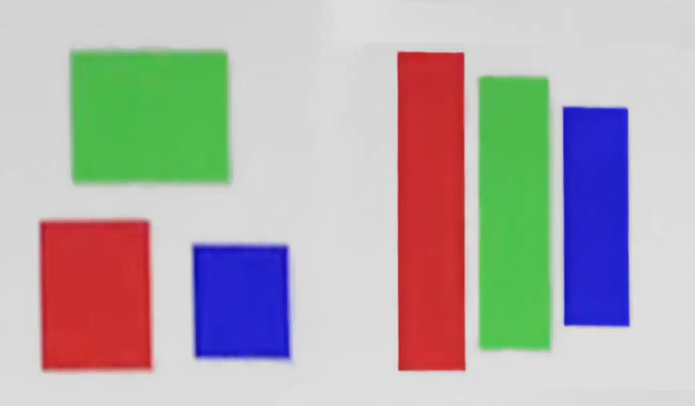
Samsung Display’s fifth-generation panels use a subpixel arrangement called V-Stripe, which FlatpanelsHD reported in detail. The V stands for vertical: red, green and blue stack in a column rather than a triangle. That is close enough to a stripe for the renderer’s assumption to hold again.
The subpixels are not equally sized. Red is larger than green, and green is larger than blue, which is what gives the column its tapered look.
The biggest technical challenges in mass-producing high refresh rate panels with a new pixel structure include reduced organic material lifespan, heat generation, and brightness degradation.
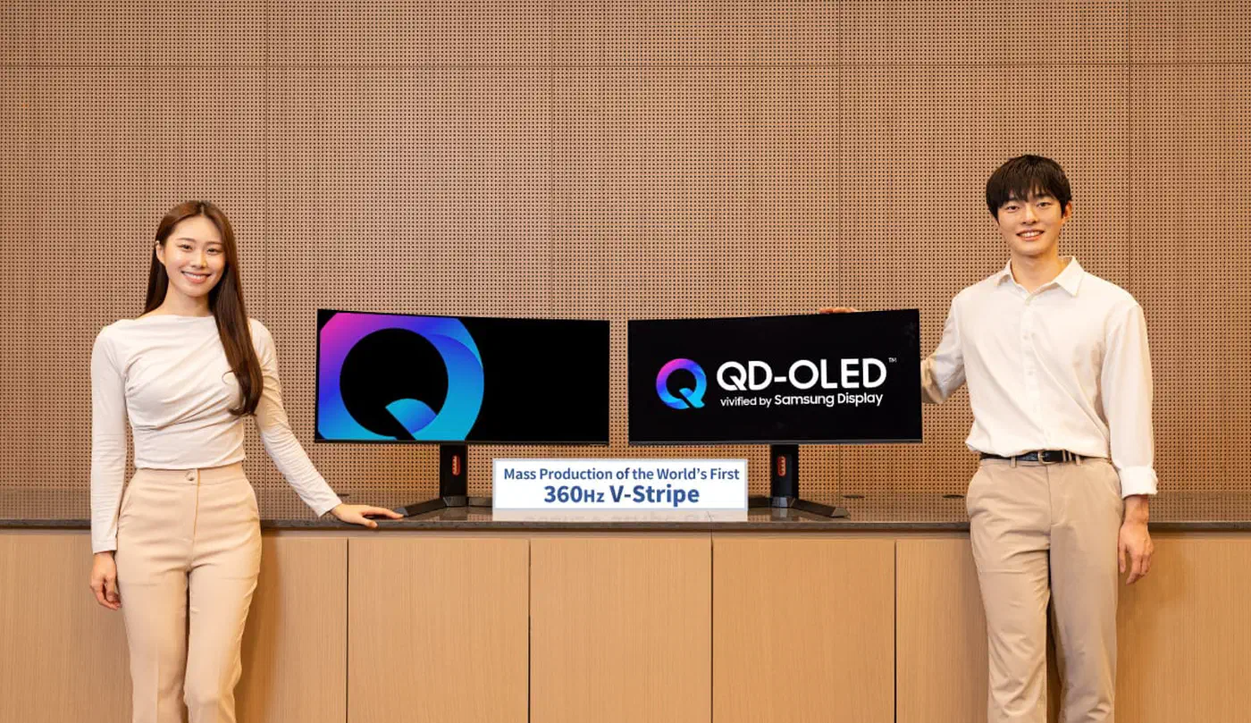
The first V-Stripe panel is a 34-inch 21:9 ultrawide running 360Hz with a 0.03ms response time. It covers 99 percent of DCI-P3 and hits 1300 nits at a 3 percent window, with 300 nits full-screen. Mass production is already under way, and the early supply goes to Asus, MSI and Gigabyte rather than to Samsung’s own Odyssey line.
| Subpixel layout | What the renderer expects | Text result at 100 percent scaling |
|---|---|---|
| RGB stripe (IPS, VA) | Exact match | Clean edges |
| W-OLED (RGB plus white) | Close, one extra emitter | Mild fringing on thin strokes |
| QD-OLED triangle | No horizontal stripe at all | Clear colour fringes on small type |
| QD-OLED V-Stripe | Vertical RGB column | Designed to remove the fringes |
The full-screen brightness figure is the useful one here. Peak brightness describes a small highlight in an HDR scene, while a spreadsheet or a code editor fills the whole panel with white, which is the condition full-screen brightness measures.
Where the 32-inch Odyssey G80SH lands
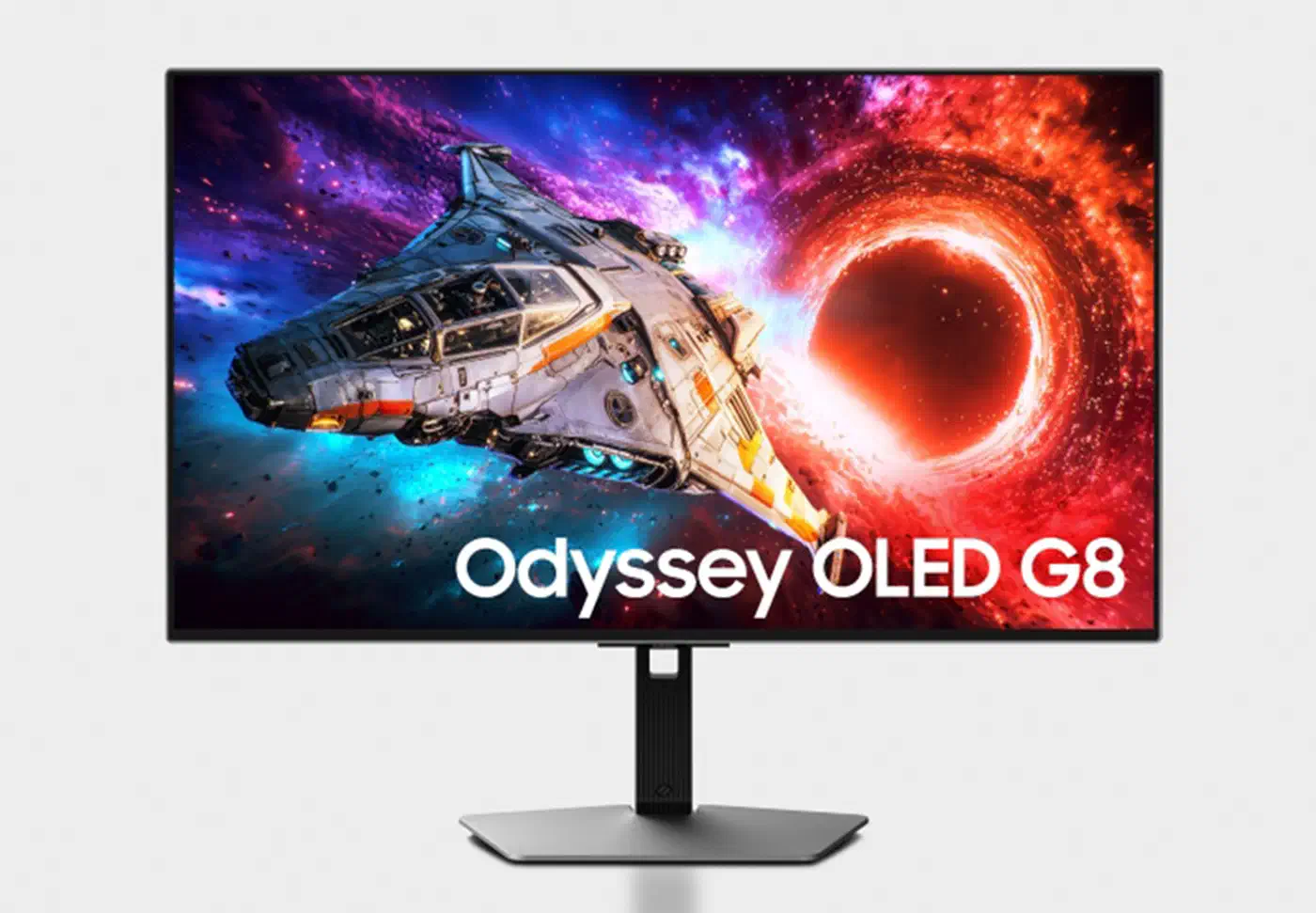
Samsung showed the G80SH at CES 2026 as a refresh of its 32-inch G8 QD-OLED. Per TFTCentral’s coverage of the Odyssey lineup , it keeps 3840 x 2160 at 240Hz. The additions are a Glare Free coating, 300-nit SDR brightness and VESA DisplayHDR True Black 500. Holding frames near that 240Hz ceiling also keeps QD-OLED brightness flicker low, since the random spikes grow more frequent as the frame rate falls. It is also the only model in the announcement with UHBR20 DisplayPort 2.1 at 80Gbps, alongside HDMI 2.1 and USB-C with 98W power delivery. The same announcement also carried the 6K Odyssey 3D G90XH , which trades pixels for a glasses-free 3D layer.
None of that touches the subpixel layout, and Anshel Sag came to the same reading in his Odyssey lineup write-up for Moor Insights & Strategy .
Finally in the G8 family is the 32-inch G80SH, which does not seem to feature the new fifth-generation QD-OLED technology.
Sag reads the G80SH panel as close kin to the 4K QD-OLED that Alienware shipped in a 32-inch monitor in 2024. The 2026 model buys you port bandwidth and an HDR certification, and leaves the text behaviour where it was.
The size change also cuts the other way on sharpness. Spreading 3840 x 2160 across a 31.5-inch diagonal gives about 140 pixels per inch. The 27-inch 4K QD-OLED that sits beside it in the same family gives about 163. Moving from 27 to 32 inches at the same resolution makes every glyph coarser, which is the opposite of what a text-heavy user wants. Samsung has not announced pricing or a ship date.
Is a QD-OLED good for coding and text work?
Weigh pixel density first, then subpixel layout, and coating last. Density does the heaviest lifting, because a glyph rendered across more pixels needs less antialiasing help in the first place. Above roughly 200 PPI the fringing argument stops being interesting, which is why a 27-inch 5K panel sidesteps the whole debate.
A V-Stripe QD-OLED should behave like an RGB-stripe monitor for text. A triangular one will still fringe however bright the spec sheet says it gets. Coating changes contrast far more than it changes sharpness.
Test it yourself. Open a white document page and set the desktop to 100 percent scaling. Pick your normal body font at your normal size. Then look at the vertical stems of letters like l, i and h from your usual seating distance. Repeat the check in your editor’s light theme. If the edges look neutral grey, you are fine; if they carry colour, you will notice it every working day.
Burn-in is the other question for anyone who leaves a fixed toolbar and status bar on screen for eight hours. Gigabyte now backs one Aorus panel with four years of burn-in cover, a year past what the rest of the field offers. Anyone who would rather sidestep the question entirely can look at a fast Mini LED panel like TCL’s 27P2A Ultra, where the backlight carries no burn-in risk at all. Brightness is the practical lever: running an OLED at a moderate SDR level cuts the wear on static elements, and holding SDR output near 150 nits captures most of that gain. Letting the pixel-shift and panel-refresh routines do their job helps as well, and so does hiding docks and taskbars.
The conservative choice for all-day text is still an RGB-stripe IPS panel at high density, or a W-OLED if you want the contrast. LG’s 27GX790B goes a step further with a Primary RGB Tandem stack that gives each colour its own emitter. A triangular QD-OLED is a gaming monitor you can work on when you have to.
What Glare Free coating gives and what it costs
Glare Free is Samsung’s anti-reflection treatment, and the G80SH is not the first Odyssey to carry it. Sag covered its behaviour in a review of Samsung’s 27-inch 4K QD-OLED . It is a separate variable that arrived well before the fifth-generation panels did.
Still, Glare Free is Samsung Electronics’ own layer. It is not QuantumBlack film , the optional coat Samsung Display puts on some Gen 4 and Gen 5 panels.
Anti-reflection layers work by scattering incoming light so a reflection lands as a dim smear instead of a mirror image. The trade is a small loss of edge definition against a large gain in usable contrast whenever the room is lit. On an OLED the gain is disproportionate, because a reflection raises the black level and a raised black level throws away the panel’s main advantage.
It pays off for anyone with a window behind the desk, overhead office lighting, or a bright room in general. In a dark room with controlled lighting a glossy panel already looks perfect, so the coating only softens it.